Reading...
![]()
Play button
![]()
Play button
![]()
Use LEFT and RIGHT arrow keys to navigate between flashcards;
Use UP and DOWN arrow keys to flip the card;
H to show hint;
A reads text to speech;
21 Cards in this Set
- Front
- Back
|
M.F. Agha
|
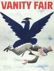
Art director for Conde Nast- Vogue, Vanity Fair- first to put cosmetics on the page. Put vanity fair title in sans-serif.
The First art director trained in modern graphic design to guide the graphic destiny of major American periodicals. 1896-1978, Born in the Ukraine to Turkish parents. Studied art in Kiev. Worked in Paris as a graphic artist. Moved to Berlin and med Conde Nast there, who was looking for a new art director for Vogue’s American edition. He persuaded Agha to come to NY as Vogue’s art director. He became art director for Vanity Fair and House & Garden as well. Introduced ?bleed photography?, white space, machine-set sans serif type, and asymmetrical layouts. Made use of full bleed, full color cover photo and double page spreads. Did covers for house and garden and advertising arts. He created breathing space in magazine spreads. |
|
|
Alexey Brodovitch
|
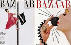
art director for harpers bazaar. brought in cassandre to do harpers bazaar covers. considered both pages as spread instead of individual units.
white space, Didot Logo, used Bodoni for Bazaar and showed that serifed type can create modern design. 1898-1971. Was a Russian who fought in WWI and emigrated to Paris and established himself as a leading contemporary designer there. Headed to the US in 1930. Was invited by the editor of Harper’s Bazaar Carmel Snow to be the art director. He remained there from 34-58. He used the best photographers and illustrators he could get, such as Henri-Cartier Bresson, A. M. Cassandre, Salvador Dali, and Man Ray. He treated the spread as a single unit. Saw contrast as the dominant tool in editorial design http://nazarenaluzzi.files.wordpress.com/2011/09/spread6hands.jpg http://icscreative.com/assets/brodovitch2.jpg |
|
|
WPA posters
|
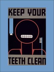
Works Progress Administration was created by Franklin Delano Roosevelt in 1935 as a response to the Great Depression. Unemployed Illustrators and Graphic Designers were paid to design posters for government-sponsored culutural events like performances, art exhibitions, and public service communications. The posters showed influences from the Bauhaus, Constructivism, and pictorial modernism. Typography approached from an aesthetic viewpoint. Richard Flota, a student at the Bauhaus, became responsible for all WPA posters in NY.
http://typophile.com/files/wpa1_teeth_4256.jpg http://img.ffffound.com/static-data/assets/6/8109671c36947288b7ae2bc379a059efeac34e85_m.jpg |
|
|
Lester Beall
|
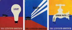
posters for people in the middle of nowhere america- rural electrician administration(a government body that promoted the use of electricity in the countryside). geometry in american design. clear, functional, and concise use of typography. Intergrated photos with abstract shapes and text.
1903 – 1969 Kansas City native who moved to Chicago and earned an Art History degree in 1926. First American born designer of consequence according to Doug Scott. Adopted sophisticated European styles. Moved to NY in 1935. Influenced by Tschichold’s Neue Typographie and the Dada movement.1937 posters for the Rural Electrification Administration whose goal it was to get electricity to rural America. Often used woodtype inspired typography, symbols like arrows, and photographs in his work. http://www.designishistory.com/images/beall/beall.jpg http://thinkingform.com/wp-content/uploads/2013/03/Lester-Beall_13.jpg |
|
|
Isotypes
|
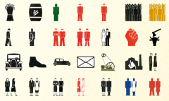
Icon system made by Otto Neutrath and wife Marie Neurath to display ideas without language for international audience. Inspiration for bathroom sign people/olympic systems.
http://3.bp.blogspot.com/-gr5MZkLMxH8/TcNPmIepWhI/AAAAAAAAAJA/gC6AGg9MwLY/s1600/Otto+Neurath.png |
|
|
London Underground System
|
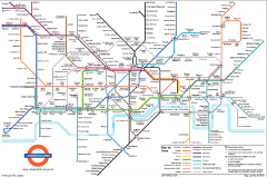
they needed a consistent brand so people would trust that. Edward Johnston did typeface, Harry Beck, who was an engineer working on the underground during 1933, did the map system = 45deg angle and didn’t show distance so people thought traveling was easier than it actually was. Map was based off of electric circuits which used color and geometry to simplify a more complex system. Influenced almost all transportation maps after, including the NYC subway system map.
http://cjb07.files.wordpress.com/2010/05/f0002213.png |
|
|
Fortune Magazine Infographics
|
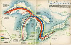
Info as visual spreads, got illustrators such as Buckminster Fuller to visually demonstrate ideas that would take much more room to explain with text
http://blog.thomasfrank.org/wp-content/uploads/2009/10/fortune75sm.jpg |
|
|
Portfolio Magazine
|
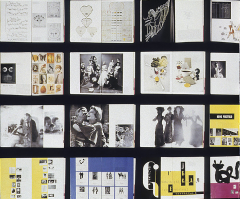
Frank Zachary, Alexey Brodovitch combined forces to create 3 issues of Magazine about design and layout, allowed them to be extremely experimental.
http://www.fotopriority.com.au/wp-content/uploads/2009/10/Brodovich.png http://img818.imageshack.us/img818/6052/5856789552.jpg |
|
|
Chermayeff & Geismar
|

Modernist branding firm. Mobil rebrand, Chase rebrand, National Geographic.
http://www.cgstudionyc.com/identities/mobil |
|
|
Paul Rand
|
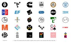
Design diety: ABC logo, UPS logo, IBM logo, Enron. american modernism, Westinghouse brand. Used to work on layout design for GQ’s predecessor, Designed MoMA’s Modern Art in Your Life book- palette plate)
https://reduxartcenter.files.wordpress.com/2012/01/randlogos.jpg |
|
|
Bradbury Thompson
|
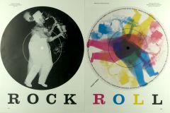
Worked in CMYK, rock/roll records, director of Westvaco Inspirations (paper & printing promotion, so he had creative freedom), art director for Mademoiselle magazine (changed masthead to sans serif, put text on magazine covers, put small thing in front of big)
http://www.shelfappeal.com/wp-content/uploads/2011/01/mademoiselle.jpg http://library.rit.edu/gda/sites/library.rit.edu.gda/files/DSC_2570_0.jpg |
|
|
Alvin Lustig
|
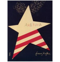
Book covers and posters with cut paper, crafty style and simple colors,
http://shelleysdavies.com/wp-content/uploads/2013/06/alvin-lustig-amerika-cover.jpg http://www.chocochips.co.uk/Alvin%20Lustig1-thumb.jpg |
|
|
Massimo Vignelli
|
tbh you know who Massimo Vignelli is
|
|
|
Penguin Books
|
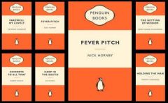
Jan Tshichold created book systems of type and color that unified books published by penguin.
https://s3.amazonaws.com/files.digication.com/M559eaf93505f71780398601a9d5aff81.jpg http://en.wikipedia.org/wiki/Penguin_Composition_Rules |
|
|
Armin Hoffman
|
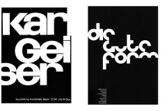
Tell poster, font made of circles- die gute form. Not grid-reliant but minimalist type floating in space. Extremely prolific design teacher at Basel School of Design and huge contributor to "swiss style"
http://thinkingform.com/wp-content/uploads/2011/06/armin_hofmann_9.jpg http://lttrfrm.files.wordpress.com/2011/03/arminhofmann.jpg |
|
|
Josef Muller-Brockman
|
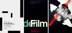
Geometry, Swiss grids, mixed type and image well. Pure constructivism -simple as possible. His stuff lined up all nice-nice. Loved Akzidenz.(noise poster, head turned, matched type)
http://www.designishistory.com/images/brockmann/posters.jpg http://www.designishistory.com/images/brockmann/beethoven.jpg |
|
|
Saul Bass
|

Branding, and then movie title design. Bell logo, movie titles, posters, quaker, at&t. The Man with the Golden arm.
https://www.youtube.com/watch?v=eGnpJ_KdqZE http://creativerepository.com/wp-content/uploads/2009/11/Saul-Bass-logos.jpg |
|
|
Psychedelic Posters
|
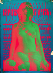
San Fran 1963 showed an art nouveau show, influenced them heavily. Posters are hard to read, pulled & challenged target audience in because they were into psychedelic music. Push Pin Studios in NYC with Milton Glaser.
http://boingboing.net/filesroot/Dylan.jpg http://famousrockposters.com/wp-content/uploads/2012/10/Picture-2-221x300.png |
|
|
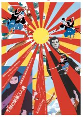
Polish Posters
|
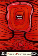
Polish people thought American posters for films were crappy so they redesigned them. Very expressionistic, different than swiss minimalism. Hamlet skull throne
http://www.polishposter.com/images/0729.jpg |
|
|
Wolfgang Weingart
|
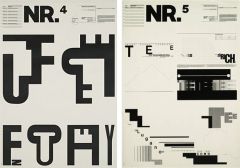
New wave. Broke all the swiss typography rules after learning from swiss people. Unwittingly started postmodern design by teaching so many people
http://www.designishistory.com/images/weingart/typography.jpg http://xponto.files.wordpress.com/2010/10/weingart1_0.jpg |
|
|
Tadanori Yokoo
|
Was influenced by Dada and American popular culture. Used techniques inspired by comic book drawings. Made surreal images using collage and a variety of techniques. Expresses the passion of curiosity of a Japanese generation that grew up with American mass pop culture. Floating type in boxes pretty cool
owned a printing company Obsessed with centering the composition Uses Japanese traditional material. A lot of imagery derived from old Japanese prints. Type as texture http://outsiderjapan.pbworks.com/f/1269538435/yokoo1.jpg |