![]()
![]()
![]()
Use LEFT and RIGHT arrow keys to navigate between flashcards;
Use UP and DOWN arrow keys to flip the card;
H to show hint;
A reads text to speech;
19 Cards in this Set
- Front
- Back
|
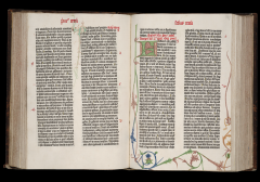
Gutenberg Bible
Johann Gutenberg 1450-1455 - Gutenberg did not invent the printing press, inks or cast metal type, but we think he is the first to put these all together. - Superb typographic legibility, texture, generous margins, and excellent presswork make this first printed book a canon of quality that has seldom been surpassed - Emulating calligraphy of hand scribes, type is mechanically done to mimic the hand lettering of the time in Germany – thick, dense, angular and falls in the blackletter classification. |
|
|
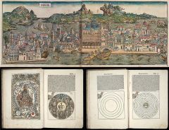
Nuremburg Chronicle
Anton Koberger 1493 - Dense, justified blackletter - Text and image together. Using metal type and woodcut process, adds complexity to book design - The raised hand of God implies the biblical story of creation - 1804 woodcut images (from 652 blocks), recombined and used more than once |
|
|
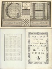
Romain du Roi
Louis Simonneau 1700 - A transitional face. - These copperplate engravings were intended to establish graphic standards for the new alphabet - Grid use to structure type. - Sponsored by French Royal Government to create a uniquely French royal letterset - The rigor of these letters, the scientific approach to them is very much in line with the enlightenment. |
|
|
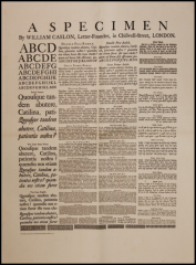
Broadside Type Specimen William Caslon 1734 - First broadside type specimen by Caslon - The straightforward practicality of Caslon’s designs made them the dominant roman style throughout the British Empire far into the nineteenth century. - Has larger x-height, is more vertical and more delicate than old style faces. It is more closely aligned with Romain du Roi. - Used in early printed editions of the Declaration of Independence and our Constitution. |
|
|
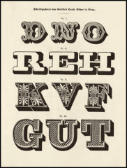
3D Fonts
Meyer Foundry - Type goes off the rails. - Prior to the 19th century, typographic communications were specifically geared towards dissemination of information. With the Industrial Revolution, competition, ability, market demand, spark a proliferation of type designs. Including new classifications. - Type gets heavier (“fat faces”), larger (“display faces”), and more decorative. |
|
|
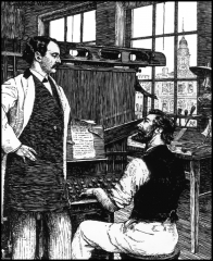
Linotype Machine
Ottmar Mergenthaler 1886 - The first line-casting keyboard typesetter |
|
|
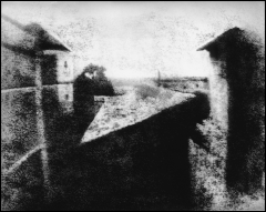
First Photograph from Nature
Nicéphore Niépce 1826 - What the Industrial Revolution did to define photography was to allow the image to be fixed on paper / a substrate (without being manually drawn). |
|
|
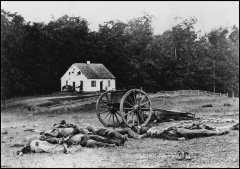
Battle of Antietam 1862 - Visual documentation took on a new level of supposed authenticity with photography - Speculation by scholars that scenes captured by photographs were “staged” or otherwise altered |
|
|
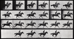
The Horse in Motion
Eadweard Muybridge 1883 - The dawn of moving pictures |
|
|
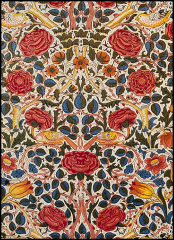
Rose Fabric Design
William Morris 1883 Concept: Reunion of art with craft Form: Medieval, botanical, ornament - Designer-as-author, literally and in terms of textiles, furniture, prints, glass, etc. |
|
|
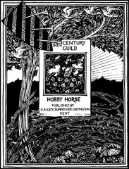
Century Guild Hobby Horse
Selwyn Image 1884-88 - Packing it with detail, Image designed a “page within a page” that reflects the medieval preoccupation of the Arts and Crafts movement - The first finely printed magazine devoted exclusively to visual arts |
|
|
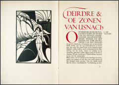
Deirdre
Jan van Krimpen 1920 - Van Krimpen: typography should be transparent and reigns supreme. |
|
|
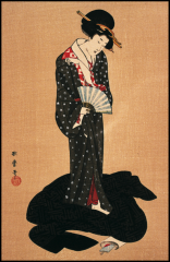
Cortesan
Utamaro late 1700s - Careful observation of facial expression and emotion - Restrained color palette and exquisitely simple composition characterized Utamaro's prints of tall, graceful women |
|
|
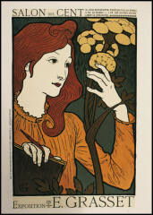
Exhibition Poster
Éugene Grasset 1894 - Quietly demure instead of exuberant |
|
|
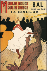
La Goulue au Moulin Rouge
Henri de Toulouse-Lautrec 1891 - Mature Art Nouveau: simplified, symbolic, dynamic space - Shapes become symbols; in combination, these signify a place and an event |
|
|
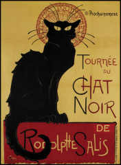
Tournée du Chat Noir du Rodolph Salis
Théophile-AlexandreSteinlen 1896 -Cat as woman |
|
|
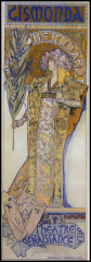
Gismonda Poster
Alphonse Mucha 1894 (11-34) -The life-size figure, mosaic pattern, and elongated shape created an overnight sensation. |
|
|
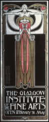
Poster
Margaret and Frances Macdonald with McNair 1895 - Merging mathematics with metaphysical |
|
|
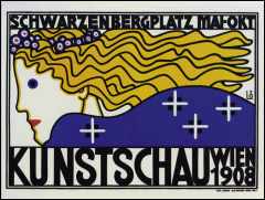
The Facet
Berthold Löffler 1908 - Break away from existing cannon |