Reading...
![]()
Play button
![]()
Play button
![]()
Use LEFT and RIGHT arrow keys to navigate between flashcards;
Use UP and DOWN arrow keys to flip the card;
H to show hint;
A reads text to speech;
13 Cards in this Set
- Front
- Back
|
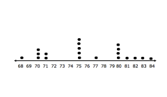
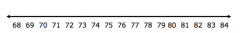
Given the heights of 20 students, in inches, create a dot plot using this number line. The heights are as follows: 68, 70, 70, 71, 75, 80, 81, 82, 84, 75, 75, 80, 75, 77, 75, 80, 83, 71, 70
|
|
|
|
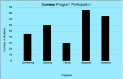
Create a histogram to show the number of students signed up for the given summer programs. Swimming: 45 students, Skating: 60 students, Tennis: 30 students, Baseball: 85 students, Aerobics: 75 students
|
|
|
|
Create a box plot for the following data set: 43, 51, 39, 45, 44, 49, 50, 47, 41, 46, 44, 43, 48, 44, 42, 45, 44.
|
Step 1: order the data from lowest to greatest. 39, 41, 42, 43, 43, 44, 44, 44, 44, 45, 45, 46, 47, 48, 49, 50, 51
|
|
|
Create a box plot for the following data set: 43, 51, 39, 45, 44, 49, 50, 47, 41, 46, 44, 43, 48, 44, 42, 45, 44.
|
Step 2: find the median of the data set. This represents Q2. The median is 44.
|
|
|
Create a box plot for the following data set: 43, 51, 39, 45, 44, 49, 50, 47, 41, 46, 44, 43, 48, 44, 42, 45, 44.
|
Step 3: find the median of each half of data (quartiles Q1 and Q3) The lower half of the data is: 39, 41, 42, 43, 43, 44, 44, 44 and its median is 43, so Q1 is 43. The upper half of the data is 45, 45, 46, 47, 48, 49, 50, 51 and its median is 47.5, so Q3 is 47.5.
|
|
|
Create a box plot for the following data set: 43, 51, 39, 45, 44, 49, 50, 47, 41, 46, 44, 43, 48, 44, 42, 45, 44.
|
Step 4: create a number line to fit the data. In this case, we need a number line that ranges from 39 to 51.
|
|
|
Create a box plot for the following data set: 43, 51, 39, 45, 44, 49, 50, 47, 41, 46, 44, 43, 48, 44, 42, 45, 44.
|
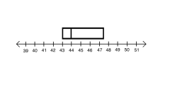
Step 5: Mark the values for Q1, Q2, and Q3 on the number line. Then, draw a box from Q1 to Q2 and from Q2 to Q3.
|
|
|
Create a box plot for the following data set: 43, 51, 39, 45, 44, 49, 50, 47, 41, 46, 44, 43, 48, 44, 42, 45, 44.
|
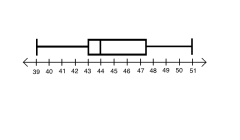
Step 6: Mark the values for the minimum and maximum numbers in the data sets. Then, draw a line from the end of each box to the minimum and maximum values.
|
|

According to the graph, How many degrees was it on the 3rd day?
|
It was 50 degrees on the third day.
|
|

In this line graph, what is the variable being measured? How would you measure this variable? What units was it measured in?
|
The variable being measured is temperature. I would measure temperature using a thermometer. The temperature was measured in degrees Fahrenheit.
|
|

Find the mean and median for the data in this line graph. Which measure of center better summarizes the data?
|
mean: 54.8 degrees F median: 55 degrees F The median and mean are so close together that they both summarize the data very well.
|
|

Find the range and the interquartile range for the data given in this line graph.
|
The range for the lower quartile is 10 and for the upper quartile is also 10.
|
|
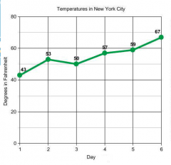
Describe the overall pattern shown in this graph. Are there any major deviations from the overall pattern?
|
The overall pattern shown in the graph is an increasing temperature. There is a small deviation on the second day, where the temperature increases a lot more than on the other days.
|