![]()
![]()
![]()
Use LEFT and RIGHT arrow keys to navigate between flashcards;
Use UP and DOWN arrow keys to flip the card;
H to show hint;
A reads text to speech;
65 Cards in this Set
- Front
- Back
|
Is an hypothesis a question or a statement? |
A statement that can be tested. |
|
|
Give an example when you would do a survey. |
The number of visits made by men and women to the dentist. |
|
|
Give an example when you would do an experiment. |
In an experiment data is collected through observations eg measuring blood pressure. |
|
|
What are the columns in a frequency table (tally table)? |
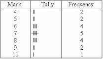
3 columns – the objects, a tally column, a frequency column |
|
|
What does qualitative data describe? |
The quality of the thing eg colour, smell, emotion |
|
|
What is quantitative data? |
Data that can be measured or counted. |
|
|
Data can be grouped in classes. What is the grouping (class interval) for more than or equal to 5 and less than 10? |
5 ≤ X < 10
|
|
|
What is primary data? |
Data collected directly by you or the researcher. |
|
|
What is secondary data? |
Data that has been collected by someone else. |
|
|
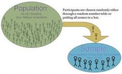
What is a population? |
Everybody being considered in a survey. |
|
|
A sample frame is… |
All the population that are available for the survey. |
|
|
What is the difference between a census and a sample? |
A census is the whole population and a sample is just a part of the population. |
|
|
When is a sample biased? |
If the sample is not representative of the population |
|
|
What is a good sample size? |
5 to 10% for small populations or √n for larger populations eg for a population of 400 sample size is √400 = 20. |
|
|
What makes a sample random? |
When each member of the population has an equal chance of being included in the sample. |
|
|
How do you collect a random sample? |
Number each member of the population and then select members randomly using the random number generator on your calculator. |
|
|
What is systematic sampling? |
Items are chosen at regular intervals eg every tenth item. |
|
|
What is a stratified random sample? |
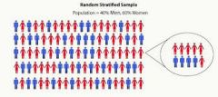
It is a random sample where each group in the sample is in the same proportion as in the population. |
|
|
Give an example of a data collection sheet? |
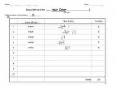
A tally table (frequency table) |
|
|
What does a questionnaire need? |

A non-leading question with a time frame and tick boxes that do not overlap. |
|
|
Why can a census be better than a sample? |
A census is more accurate, unbiased and all are included. |
|
|
Why can a sample be better than a census? |
A sample is cheaper and quicker. |
|
|
What is a control group? |
A group in an experiment that is not tested by the experiment and does not know this. |
|
|
What is a two-way table? |
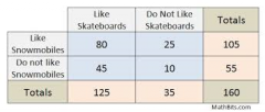
Compares two variables – one at the top of the table and one to the side. |
|
|
What is a pictogram? |
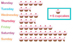
A frequency table that uses a picture or symbol to represent an amount. |
|
|
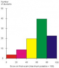
The width of bars in a bar chart must… |
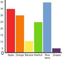
be the same and separated by equal gaps. |
|
|
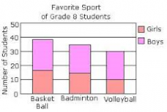
How are bars drawn in a dual bar graph? |
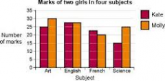
Two bars are drawn touching with an equal gap to the next two bars. Remember a key… |
|
|
In a line graph points are… |

joined with a line and can show a trend. |
|
|
In a vertical line graph (bar line graph) instead of bars you draw… |
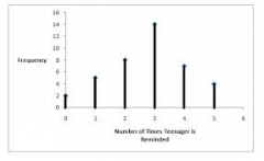
vertical lines. |
|
|
How do you find the angles in a pie chart? |
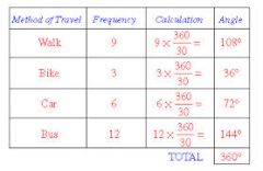
Frequency multiplied by 360 and divided by the total frequency (add up the frequency column). |
|
|
When might a graph be misleading? |
When the vertical axis does not start at zero. |
|
|
What must you do with a stem and leaf diagram? |
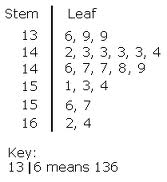
Put the data in order and draw a key. |
|
|
What is a composite bar graph? |
The vertical axis often represents 100%. |
|
|
What is a population pyramid? |
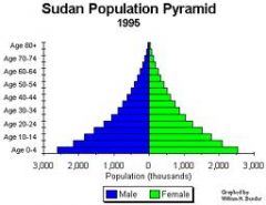
It compares percentages of populations by age and gender. |
|
|
What is a choropleth map? |
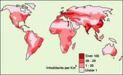
In a choropleth map areas are shaded differently to show a distribution. |
|
|
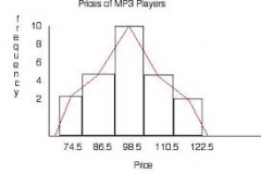
What is a histogram with equal class intervals? |
It is a bar chart where the bars touch and the numbers are written on the lines of the bars and not under the middle of each bar. |
|
|
How do I draw a frequency polygon? |
Draw a histogram (bar chart) first and then join the middle of each bar with a straight line. |
|
|
How do you find the mode? |
The most common. |
|
|
How do you find the median? |
Put them in order and find the middle. |
|
|
How do you find the mean? |
Add all the data and divided by how many. |
|
|
How do you find the range? |
Highest value take away the lowest value. |
|
|
How do you find the mean from a frequency table? |
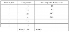
Create a new column by multiplying the data by the frequency. |
|
|
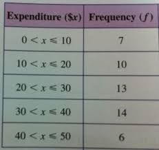
How do you find an estimate of the mean from a frequency table of grouped data? |
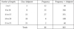
Create a new column that is the midpoint of the groups. |
|
|
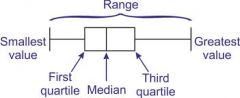
What data do you need for a box and whisker diagram? |
Lowest value and highest value are the whiskers. |
|
|
How do you find a percentage of a quantity? |
Divide by 100 and multiply by the percentage. |
|
|
How do you increase or decrease by a percentage? |
Divide by 100 and multiply by the percentage. |
|
|
What is the index in the base year? |
100 (100%) |
|
|
Give an example of a trend. |
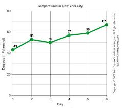
Sales of CDs are increasing over time. |
|
|
What does the range show when compared to another range? |
The smaller the range the more consistent the data. |
|
|
What types of correlation are there on a scatter diagram? |
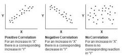
Positive, negative and none. |
|
|
What is interpolation? |
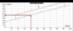
Interpolation is using the line of best fit between the first and last piece of data. |
|
|
What is extrapolation and its limitations? |
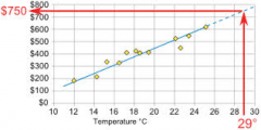
Extrapolation is using the line of best fit beyond the data given (ie before the first piece of data and after the last piece of data). |
|
|
If an event is certain, what is its probability? |
1 |
|
|
If an event is impossible, what is its probability? |
0 |
|
|
An event is likely if its probability is more than… |
½ |
|
|
An event is unlikely if its probability is less than…. |
½ |
|
|
What is a sample space diagram? |
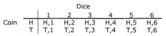
A table used to show the outcomes of two events happening at the same time. |
|
|
How do you find the probability of something NOT happening? |
1 take away the probability of it happening. |
|
|
Total probabilities add up to… |
1 |
|
|
How do you find the expected number of successes from trials? |
Probability times the number of trials. |
|
|
What is the difference between relative frequency (experimental probability) and theoretical probability? |
If we cannot calculate probabilities from equally likely outcomes then we need to do an experiment to find the probabilities. |
|
|
What is: _ x |
_ x is the mean |
|
|
How do you draw a line of best fit through a mean point? |
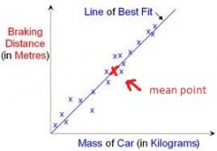
First, plot the mean point. Then draw a line of best fit making sure it goes through the point you just plotted for the mean. |
|
|
What do you compare when you compare box plots? |
1. Compare medians (middle line of box)
2. Compare ranges (distance between the ends of the whiskers)
If more than 2 mark question, compare also interquartile range and compare in context e.g. the median of A is higher and shows that the weight of adults is on average higher. |
|
|
When you go down a tree diagram you... |
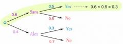
multiply eg 0.6 x 0.5
Each fork must add to one |