![]()
![]()
![]()
Use LEFT and RIGHT arrow keys to navigate between flashcards;
Use UP and DOWN arrow keys to flip the card;
H to show hint;
A reads text to speech;
31 Cards in this Set
- Front
- Back
|
stem and leaf plot |
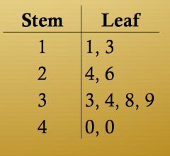
Put stems on left side and leaves on right in ascending order
Be sure to put a null if a stem doesn't have the value |
|
|
back-to-back stem and leaf |
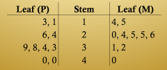
for two sets of data
stem goes in middle and put leaves on either side |
|
|
skewed left (negatively skewed) |
mean is less than median
the mean is being made less because of too many lower values
most of the higher frequencies appear on the right, however |
|
|
skewed right (positively skewed) |
mean is more than the median
most of the higher frequencies appear on the left, however |
|
|
frequency table |
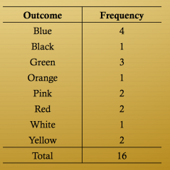
a set of data against their associated frequencies
|
|
|
frequency distribution |
shows all of the variables and their associated outcomes (frequencies) |
|
|
probability distribution |
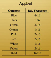
the frequency divided by the total number of outcomes
relative frequency |
|
|
cumulative frequency |
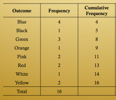
add up each frequency along the way (down the column)
the total should be the total of all the data |
|
|
cumulative relative frequency |
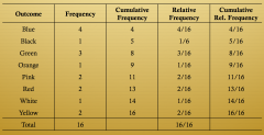
the cumulative frequency over the total amount of outcomes
the end result should be 1 |
|
|
bar chart (qual) |
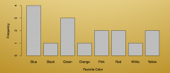
used for qualitative data with their associated frequencies (much like a frequency table)
x= outcomes y= frequency
bars do not touch |
|
|
pareto chart (qual) |
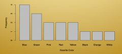
much like a bar chart, but you order it in descending order (highest to lowest frequencies) |
|
|
pie chart (qual) |
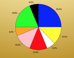
each piece corresponds to a relative frequency of each outcome
to find percent: frequency/total
to find degree: percent*360 |
|
|
pictogram (qual) |
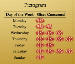
each picture corresponds to a fixed value (frequency of outcomes) |
|
|
contingency table (qual) |
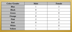
a frequency table of two-way data
has one variable (color) with two separate frequencies (male and female preference) |
|
|
tree diagram (qual) |
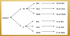
represents the relationship between multi-stage outcomes |
|
|
how to make the best graph |
1. include title 2. label each axis 3. use proper scaling |
|
|
histogram (qual and quant) |
much like a bar graph, except the bars touch
shows the frequency/probability distribution
width of bars: class width height of bars: frequency
|
|
|
parts of a histogram |
1. tolerance & number of classes 2. class width 3. class width 4. class boundaries 5. class marks (midpoints) |
|
|
how to calculate tolerance |
the level of decimal precision in the measure data
19.53 = 0.01
120 = 1 |
|
|
how to determine class width |
divide range by class and round up based on tolerance
or
look at the distance between each LCL and UCL and add one tolerance
|
|
|
how to determine class limits (LCL and UCL) |
start by calculating all the LCL 1. the first LCL is the min 2. add a class width to each previous LCL to obtain the rest
now calculate the UCL 1. subtract one tolerance to the 2nd LCL 2. add a class width to each previous UCL to obtain the rest |
|
|
how to determine class marks |
add each LCL and UCL and divide by 2 |
|
|
how to determine class boundaries |
subtract 1/2 tolerance to each LCL
add 1/2 tolerance to each UCL |
|
|
how to create histogram |
mark each end of the bars using the class bounds
mark the midpoint for each corresponding bar
make sure they all touch (only time they don't is if theres a freq of 0)
plot against their frequency (or cumulative if asked)
|
|
|
ogive graph (quant) |
plots the cumulative frequencies of the variables
a line graph |
|
|
how to construct an ogive graph |
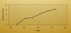
start with 0, and use the class boundaries (UCB) corresponding to a said frequency
then take the cumulative frequency of the net UCB, and so on
the last data point should be the total of all the outcomes |
|
|
box plot (quant) |
uses the five-number summary
{min, Q1, median, Q3, max} |
|
|
constructing a box plot |
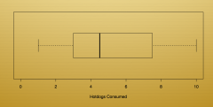
1. Put the data in ascending order 2. Find the minimum and maximum 3. Compute the median 4. Compute Q1 and Q3 5. Construct the plot using the information found in the previous steps |
|
|
outliers |
if not bell-shaped, an outlier is found by:
[(Q1 – 1.5*IQR),(Q3 + 1.5*IQR)] |
|
|
interquartile range |
found by subtracting Q3 to Q1 |
|
|
scatter plot |
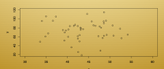
represents 2 variable data (bivariate) using a rectangular coordinate plane (x,y)
lets us see how one variable relates to another
line of best fit is often fashioned into the data |