![]()
![]()
![]()
Use LEFT and RIGHT arrow keys to navigate between flashcards;
Use UP and DOWN arrow keys to flip the card;
H to show hint;
A reads text to speech;
4 Cards in this Set
- Front
- Back
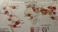
Comment on the way this data has been presented in the located proportional circles graph. |
Positive - easy to see the spatial pattern due to the size of the circles and their colour code Negative -the circles overlap, making it difficult to see which countries they refer to and to measure the size on the key -map is out of date, making it unreliable, however it was once accurate as the UN is a reliable source - numbers on the key overlap
|
|
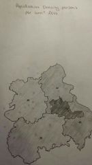
Comment on the way this data has been presented in the choropleth map |
Positive - shows the distinctions between the shades clearly - easy to see the spatial pattern Negative - it won't be accurate data as the figures have been rounded. |
|
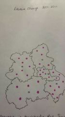
Comment on the way this data has been presented in the dot graph |
Negative - you can't really see the spatial pattern at first glance; you have to count the dots
- there's a lot of rounding so the data isn't very accurate. |
|
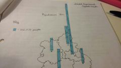
Comment on the way this data has been presented in the located proportional bars |
Positive - effective when the differences between data are dramatic Negative - harder to read when the data is closer together |