Reading...
![]()
Play button
![]()
Play button
![]()
Use LEFT and RIGHT arrow keys to navigate between flashcards;
Use UP and DOWN arrow keys to flip the card;
H to show hint;
A reads text to speech;
38 Cards in this Set
- Front
- Back
|
X-axis is used to display the ?? variable
While the Y-axis is used to display the ?? variable |
X - Independent
Y - Dependent |
|
|
Bar graphs depict ?? ?? for what level(s) of data?
|
Frequency data for nminal level variables
|
|
|
In making a bar graph it is important to space the bars evenly on the horizontal axis because...
|
It reminds the viewer that the categories represent differences in TYPE not amount
|
|
|
Height of the bars tells the viewer...
|
how frequently the category occured
|
|
|
A pie graph is also known as ...
|
a circle graph.
|
|
|
Pie graphs display what level(s) of data?
|
They display all levels:
Mominal, Ordinal, Interval, and Ratio |
|
|
Pie graphs are used when the the categories/values constitue a..
|
whole.
|
|
|
Do determine how large to draw each "piece" you need to...
|
Multiply the % of a variable by 360○
|
|
|
Histograms display what level(s) of data?
|
Ordinal, Interval, and Ratio
|
|
|
The bars for a histogram display what information?
|
The bars show the frequency of catagories/values associated with a varaible
|
|
|
Unlike the bar graph, the bars of a histogram touch sides because...
|
the categories represent differences in the AMOUNT of a variable
|
|
|
Frequency Polygons are also known as
|
Line graphs
|
|
|
Frequency Polygons are similar to histograms because they...
|
dispaly the overall shape of the distribution of scores.
|
|
|
Midpoint means...and is used when...
|
Means: the smallest and alrgest value divided by 2
Used when: scores are grouped into intervals to find one single number |
|
|
Frequency Polyons display what level(s) of data?
|
Interval and Ratio
|
|
|
Stem-and-leaf data helps display how data is...as well as the...
|
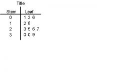
How data is distributed as well as the original scores
|
|
|
Stem-and-leaf diagrams are effective means of...
|
conducting preliminary data analysis.
|
|
|
Single-system designs are favorable because...
|
1) Are Easy-to-use
2) Affordable means of monitoring client performance |
|
|
Single-system designs consist of an A -.... and B-....
|
A - Baseline
B - Intervention time frames |
|
|
Single system designs help providers see...
|
potential benefits and limiations in a give intervention.
|
|
|
In a single-system design... a SOLID line =
a dotted line = a Dashed line = |
SOLID = average/mean
dotted = 2 standard deviations above pretreatment average Dashed = 2 points below |
|
|
Truncating
-definition- |
Cutting off the vertical axis
|
|
|
When a person has "exploded" a pie graph it means...
|
They have visually seperated a piece from the rest of the pie to highlight it.
|