Reading...
![]()
Play button
![]()
Play button
![]()
Use LEFT and RIGHT arrow keys to navigate between flashcards;
Use UP and DOWN arrow keys to flip the card;
H to show hint;
A reads text to speech;
16 Cards in this Set
- Front
- Back
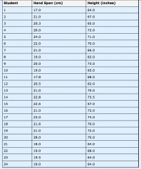
Construct a scatter plot from the data given in the table.
|

|
|
What patterns do you see in the data? What type of association is there between there variables?
|
The data seems to show an upward trend; dots smaller hand span seems to correlate with a smaller height. There seems to be positive linear association between the two variables.
|
|
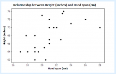
Construct a scatter plot from the data given in the table.
|

|
|
What patterns do you see in the data? Is there evidence of clustering? Are there any outliers?
|
Most of the data points are clustered together at the bottom left of the scatter plot. There are two outliers, the African Elephant and Asian Elephant, whose points are nowhere close to the rest of the data.
|
|
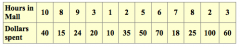
Construct a scatter plot from the data given in the table.
|

|
|
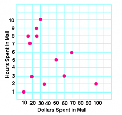
What patterns do you see in the data? Is there a linear or non-linear association between the variables?
|
There is no apparent relationship between the mall and the number of dollars spent in the mall. The association is non-linear
|
|
|
What is widely used to model relationships between two quantitative variables?
|
Straight lines are widely used to model relationships between two quantitative variables.
|
|
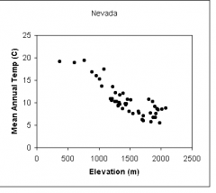
Informally fit a straight line (line of best fit) for this scatter plot.
|

|
|
Assess the fit of your straight line. How close is your line to the data points?
|
This best fit line is close to all of the data points, though it only crosses through 2 points. This best fit line is an accurate way to show the relationship between the two variables
|
|
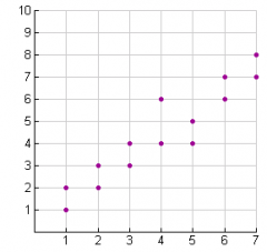
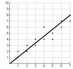
Informally fit a straight line (line of best fit) for this scatter plot.
|

|
|
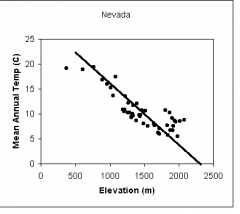
Assess the fit of your straight line. How close is your line to the data points?
|
This best fit line is a decently accurate way to model the relationship between the two variables. It crosses through several data points, but there are more points below the line than above.
|
|
|
The slope of a graph showing the relationship between distance and time correlates to what measurement?
|
The slope correlates to velocity
|
|
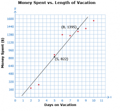
Find the slope of the best fit line for this graph. What does the slope tell us about the amount of money spent vs. days on vacation?
|
m=∆y/∆x m=(1935-822)/(8-5) m=1113/3 m=371 This tells us that, on average, $371 is spent per day on vacation.
|
|
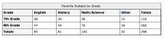
At a middle school, students were asked to identify their favorite academic subject and whether they were in 7th grade or 8th grade. This table shows the results. Is there an association between favorite academic subject and grade for students at this school? Support your answer by calculating the relative frequencies using the given data.
|
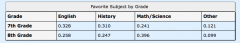
The relative frequencies are shown in the table. There is some association between favorite subject and grade. A higher percentage of 7th graders than 8th graders prefer English and history, while a higher percentage of 8th graders than 7th graders prefer math/science.
|
|
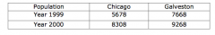
What type of relationship can be seen between the populations of Chicago and Galveston in this table?
|
Both Chicago and Galveston experienced population growth between 1999 and 2000, and Chicago's population was less than Galveston's in both years.
|
|

Calculate the percentage increase of the population in Chicago and Galveston between 1999 and 2000. Which city had a higher percentage of increase?
|
Chicago had a higher percentage of increase, with a rate of 31.66% while Galveston's percentage of increase was 17.26%.
|