![]()
![]()
![]()
Use LEFT and RIGHT arrow keys to navigate between flashcards;
Use UP and DOWN arrow keys to flip the card;
H to show hint;
A reads text to speech;
34 Cards in this Set
- Front
- Back
- 3rd side (hint)
|
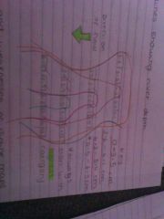
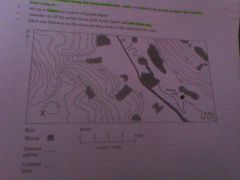
Annotate the os map with key features of the river and surrounding drainage basin |
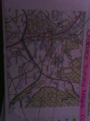
Forest which intercepts precipitation which increases interception Wide valley floor due to few contour lines Meandering river with the river flowing SE River in its middle course so gains velocity Urban areas increase surface run off |
|
|
|
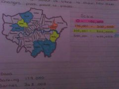
With reference to the map, describe |
USE GRID REFERENCE |
|
|
|
Base map |
Layers taken off a map |
|
|
|
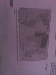
How could this photo be used to explain the process of meander formation? Annotate the map. |
Fastest flow is on the outside which has the highest rates of erosion forming a river cliff Deep pools on outside of meanders as erosion occurs Valley widened by lateral erosion Shallow riffles as gravel is deposited |
|
|
|
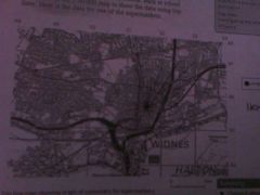
Annotate the os map with key features of the lower course of the river? |
Meanders Gently sloping land Floodplain- flat land Land changes- more urban areas Gently sloping valley sides Channel widens |
|
|
|
Key is map skills |
Grid reference Measuring distances and comparing to the scale bar Using contour lines to see relief and to get heights above sea level When annotating a os map with features of a drainage basin think relief but also land use Be able to identify parts of a city Measuring height by counting contour lines (always 10m or 5 m gap) |
|
|
|
Measuring distances. |
Use ruler for straight distances Use a piece or string for measuring distance of a river Use scale bar by working out what 1cm is in km or miles |
|
|
|
Os maps part of a city |
Type and density if housing Transport Green space Industry Golf courses Residential, commercial and recreational |
|
|
|
Showing movement on maps: flow lines |
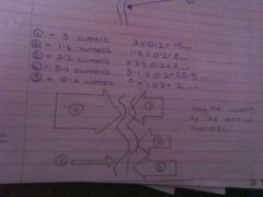
A flow line map is used to show the actual flow and direction of something. The flow line is drawn proportionally to the number travelling along a route using a suitable scale
Only width of the arrow matters
E.g 1mm=0.2 cumecs. 3 cumecs = 3÷0.2=15mm
Strengths Visual- able to see patterns Show the actual route
Weakness Have to interpret them to get raw data Not suitable for complex routes |
|
|
|
Showing movement on maps: desire lines |
In desire line maps the line ignores the actual route taken but simply concentrates on the origin, the destination and the number on the route. Often used to show migration rate.
Only width of arrow matters
Strengths Visual- see patterns easily Simplify complex routes
Weaknesses You have to interpret them to get raw data Don't show actual routes |
|
|
|
Showing movement on maps: trip lines |
Trip lines are used to display information that relates to trips and journeys taken by individual people.
Width of line doesn't vary.
Strengths Visual Can judge lengths and distances
Weaknesses Have to interpret them to get raw data Don't show amounts due to individuals journey only |
|
|
|
Located proportional symbols on a map |
These are used to represent the amount or size of something on a map. The shapes can be circles, squares or straight lines.
Number if sediment ÷ total pebbles X 100 to work out a percentage Divide total by 360 to get 1 angle in a pie chart
Strengths Visual Show the location
Weaknesses Anomalous data which is high or low cant easily be represented |
|
|
|
Showing density on maps: chloropleth maps |
Chloropleth maps are used to observe patterns which would remain hidden in numerical data. A system if colour is used to show how data changes from place to place.Uses categories.
Strengths Visual Easy to do Grouping together data using categories which simplifies it
Weaknesses Unless you use a logical colour coding method you can't see a pattern Anomalies screw categories Large categories lose accuracy |
|
|
|
Showing density on maps: isoline |
Isolines are lines that represents the same value along their whole length such as contour lines
Isolines need to start drawing around highest values in the key Draw your line around any values that fit inside each band (section on key) Any numbers which are exactly on the edge of a category- draw the line through the number Always start with highest category
Strengths Visual Can see raw data Can add layers using colour
Weaknesses Complex Anomalies make the technique more difficult |
|
|
|
Showing density on maps: dot maps |
Dot maps are a useful way of identifying the density of a particular variable such as population. It's possible to estimate numbers in a particular place unlike a chloropleth map. Strengths Visual Can calculate numbers by counting dots Weaknesses Often have to round numbers up or down If there is a really high number of dots then they blend together |
|
|
|
Compound line and bar graphs |
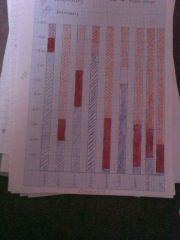
Compound bar graph These are when individual bars are broken down to show more than one piece if information
Compound line graphs Show more than one piece of information on one graph
Strengths Visual Able to add more than one piece of data to bars or lines
Weaknesses Easy to misread data Without colour it's really hard to compare values On line graphs especially when colour is added and where the scale is large it's difficult to read off values |
|
|
|
Triangular graphs |
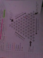
Show the percentage of 3 types of something They allow visual comparison between places and when analysing them clustering should be looked for Always read the axis at 45 degrees
Strengths Visual so that you can see patterns and clustering 3 pieces of data can be shown on the same graph Can read off the raw data
Weaknesses Only works with 3 pieces if data Complicated To analyse patterns it's important a key is added in order to know what site is being represented You have to have a percentage |
|
|
|
Scatter graphs |
These graphs are used to investigate correlation and are often used alongside spearman's rank.
How to draw a line of best fit: Ignore the anomaly Straight line Drawing so there is an equal number of points on each side of the line Going through as many points as possible Doesn't need to start from zero
|
|
|
|
Divergent line graphs |
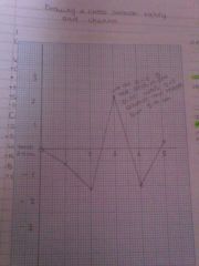
This is a graph where data is spread on either side of the X axis X axis line becomes the mean and data is plotted either side Have to work out how far below or above the value is from the mean |
|
|
|
Describe the difference between the valley and channel |
Valley Changes from vertical to lateral erosion Steepness of sides decreases downstream The valley widens downstream Section A v shaped valley with steep sides Section C is flat Channel Sediment size decreases Section A is narrow in comparison to B where it becomes much wider |
|
|
Drawing a cross section of a valley and channel |
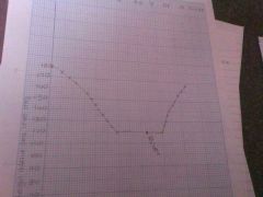
Put a piece of paper along the cross section line, mark and label all points at which contour lines cross it Set up a frame on a separate piece of paper Transfer all points from your scrap piece of paper and join them Label any features and label the axis |
|
|
|
Measures of centeral tendency |
Mean- add up all data and divide by how many values you have Median- mid point of data work out by putting in rank order and selecting the middle number Mode- most common digit Range- highest takeaway lowest |
|
|
|
Upper quartile |
Put data in order from highest to lowest Formula: n+1÷4 Formula gives you Humber of values to count down you data set from highest to lowest |
|
|
|
Lower quartile |
Put data in order from highest to lowest Formula: n+1÷4 X3 Count this value down your data set from highest to lowest |
|
|
|
Inter quartile range |
Upper quartile - lower quartile |
|
|
|
Dispersion diagram |
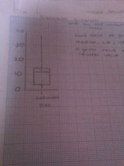
Plot data on graph
Add box and whisker plot by adding mean, lower quartile, upper quartile and highest &lowest value |
|
|
|
Standard deviation |
Standard deviation helps us to measure deviation around the mean to find out how close values are We can tell little about deviation of data set by working out the inter quartile range but standard deviation gives us a reliable statistical value. The higher the standard deviation the more deviation there is around the mean. The lower the standard deviation the less deviation around the mean. |
|
|
|
Normal distribution curve |
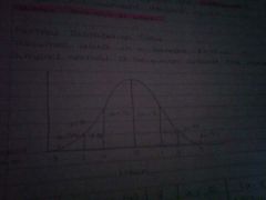
Assumes data in a sample follows a simple or normal distribution around the mean |
|
|
|
Radial diagrams |
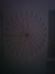
Used to plot data around a centeral point Join dots |
|
|
|
Logarithmic scales |
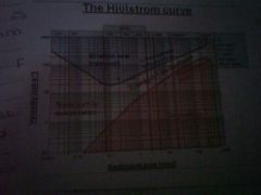
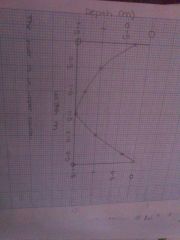
Each unit increase on the logarithmic scale represents an exponential increase in quantity Presentation of data on a logarithmic scale can be helpful when the data covers a large range of values The use of the scale of the values reduces a wide range of data to a more manageable size E.g. the hjulstrom curve |
|
|
|
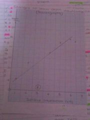
Explain the relationship between velocity, particle size, erosion, transportation and deposition. (5 marks) |
Larger sediment requires a higher velocity to be eroded For example a particle which is 0.1mm long only requires a velocity of 20 cm is to be eroded however a particle of 200mm length is eroded at 300cm per second Exceptions are the smallest particles still require large velocities to be eroded |
|
|
|
Using information and communication technolgy |
Annotation of photographs - label and use this means that Satellite images GIS ( geographical information systems) Examples of GIS Google earth- uses satellite data to provide detailed aerial images of different parts of the world. This allows us to study the characteristics of settlements closely. The met office- provides up to date data on weather patterns in the UK which could be used to predict flooding. Census- provides vast amount of information of the population of the UK. This mean we are able to study and represent popualtion structures. Environment agency- maintains up to date data about a range if environmental issues affecting all parts of the UK which allows us to see land use of an area. |
|
|
|
Spearman's rank |
Rank data from highest to lowest (1-12) Work out the difference between ranks Square this value Use spearman's rank equation Test for significance |
|
|
|
How to work out degrees in a pie chart |
Work out the degrees needed for 25% 25÷100=0.25 X360 = 90 degrees |
|