![]()
![]()
![]()
Use LEFT and RIGHT arrow keys to navigate between flashcards;
Use UP and DOWN arrow keys to flip the card;
H to show hint;
A reads text to speech;
35 Cards in this Set
- Front
- Back
|
vertical lines |
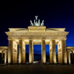
They represent dignity, formality, stability, and strength. They are the walls in the Brandenburg Gate in Berlin. |
|
|
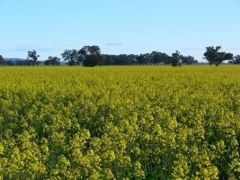
horizontal lines |
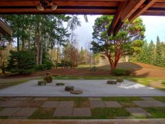
They represent calm, peace, and relaxation. They appear in this photograph of a backyard. |
|
|
diagonal lines |
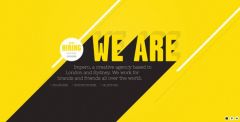
They represent action, activity, excitement, and movement. They make up part of this company’s announcement about hiring. |
|
|
curved lines |
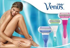
They represent freedom, the natural, softness, and a soothing feeling or mood. They appear in this advertisement for the Gillette Venus razor, which women use to shave. |
|
|
geometric shapes |
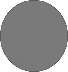
They are based on mathematics. This circle is an example. |
|
|
natural shapes |
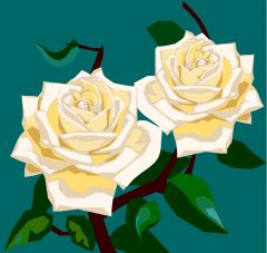
They come from nature. These flowers are examples. |
|
|
abstract shapes |
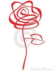
They are simplified versions of natural shapes. This rose is an example. |
|
|
nonobjective shapes |
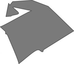
They come from no specific elements. This blob is an example. |
|
|
hue |

It is the technical name given to a color. It distinguishes one color from another. An example is red. |
|
|
red |
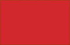
This color is interpreted as exciting, aggressive, or passionate. |
|
|
orange |
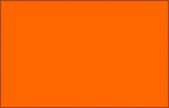
This color is interpreted as earthy, warm, or hopeful. |
|
|
yellow |
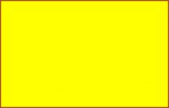
This color is interpreted as cheerful, sunny, or cowardly. |
|
|
green |
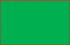
This color is interpreted as restful, envious, or fresh. |
|
|
blue |
This color is interpreted as calming, cool, or depressed. |
|
|
purple |
This color is interpreted as drama, rich, or royal. |
|
|
white |
This color is interpreted as innocent, pure, or peaceful. |
|
|
black |
This color is interpreted as sophisticated, gloomy, or mysterious. |
|
|
gray |
This color is interpreted as old, sad, or modest. |
|
|
value |
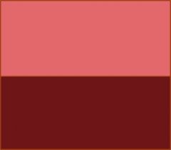
It is the lightness or darkness of a color. The top color is a lighter pink and the bottom color is a darker maroon. |
|
|
intensity |
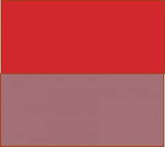
It is the brightness or dullness of a color. The top color is brighter and the bottom color is duller. |
|
|
warm temperature |
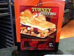
Colors of red, orange, and yellow. This advertisement of a Cosi sandwhich illustrates these colors. |
|
|
cool temperature |

Colors of green, blue, and violet. This advertisement of an Aston Martin car shows these colors. |
|
|
texture gradient |
Most surfaces, such as a wall or road. As the surface gets farther away, the texture gets finer and appears smoother. In this picture, flowers that are farther away are smoother than those that are closer. |
|
|
interposition |
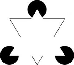
It creates space by ensuring that nearer objects block more distant ones. In this example, the triangle, which is nearer, blocks the inverted triangle and circles, which are farther. |
|
|
relative height |
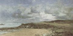
It creates space by ensuring that the closer an object is to the horizon, the more distant it seems. In this painting, the mountains are closer to the horizon and thus appear farther away. |
|
|
relative size |
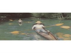
It creates space by ensuring that smaller objects seem to be further away than closer ones, when the objects are supposed to be the same size. In this picture, the larger person in the canoe appears closer than his counterpart in the background. |
|
|
linear perspective |
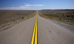
It creates space by ensuring that parallel lines converge, thus appearing to vanish into infinity. In this picture, the yellow lines in the middle of the road converge, giving the appearance of a road that goes on forever. |
|
|
shading |
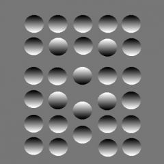
It uses darkening or lighting to create an illusion of space. In this example, a flat picture appears to have three-dimensional circles, some being recessed and others being raised. |
|
|
aerial perspective |
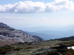
Objects that are far away tend to get blurry because of the atmosphere, creating a sense of space. In this photograph, mountains in the background are hard to see. |
|
|
unity |
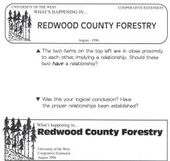
It ensures that the multiple elements create a meaningful whole. This example shows how a logo can use proximity to achieve unity, by ensuring that elements that are cognitively connected are visually connected. The bottom version of the logo is better than the top version, because the image of the trees should be close to the title “Redwood Country Forestry.” |
|
|
balance |
It ensures that weight is equal on the left and right sides. In this, example the flyer uses several small elements on one side to balance out the fewer large elements on the other side. |
|
|
emphasis |
|
|
|
high angle |
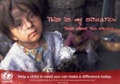
It refers to the fact that when the viewer looks down on a figure, he/she looks small and thus powerless. In this UNICEF advertisement, the viewer looks down on a seemingly small child, who seems helpless. |
|
|
low angle |
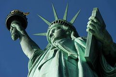
It refers to the fact that when the viewer looks up at a figure, he/she looks large and thus powerful. In this advertisement, the viewer looks up at a dominating force and icon. |
|
|
contrast |
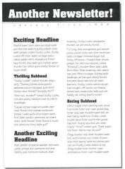
It refers to a difference between elements, which creates variety and thus can interest the viewer. In this example, a newsletter uses differing sizes of type font and bolding to maintain the attention of the reader. |