![]()
![]()
![]()
Use LEFT and RIGHT arrow keys to navigate between flashcards;
Use UP and DOWN arrow keys to flip the card;
H to show hint;
A reads text to speech;
20 Cards in this Set
- Front
- Back
- 3rd side (hint)
|
frequency distribution |
lists each category of data and the number of occurences for each category of data |
|
|
|
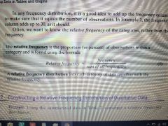
relative frequency |
relative frequency =frequency/ sum of all frequencies |
|
|
|
relative frequency distribution |
lists each category of data together with the relative frequency |
|
|
|
bar graph |
constructed by labeling each category of data on either the horizontal or vertical axis and the frequency or relative frequency of the category on the other axis. |
|
|
|
Pareto chart |
a bar graph whose bars are drawn in decreasing order of frequency or relative frequency. |
|
|
|
pie chart |
a circle divided into sectors. each sector represents a category of data. the area of each sector is proportional to the frequency of each of the category. |
|
|
|
histogram |
constructed by drawing rectangles for each class of data. the height if each rectangle is the frequency or relative frequency of the class. the width if each rectangle is the same and the rectangles touch each other. |
|
|
|
lower class limit |
the smallest value within a class |
|
|
|
upper class limit |
the largest value in a class |
|
|
|
class width |
the difference between consecutive lower class limits |
largest data value -smallest data value / number if classes |
|
|
open ended |
if the first class has no lower class limit or the last class has no upper class limit |
|
|
|
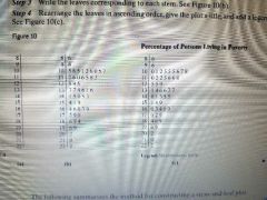
stem-and-leaf plot |
use the digits to the left of the rightmost digit to form the stem. each rightmost digit forms a learn |
|
|
|
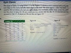
split stems |
|
|
|
|
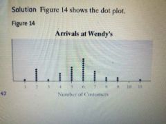
dot plot |
place each observation horizontally in increasing order and place a dot above the observation each time it is observed |
|
|
|
uniform distribution |
the frequency of each value of the variable us recently spread out across the values of the variable. |
|
|
|
bell shaped distribution |
the highest frequency occurs in the middle and frequencies tail off to the left and right of the middle. |
|
|
|
skewed right |
the tail to the right of the peak is longer than the tail to the left of the peak |
|
|
|
skewed left |
the tail to the left if the peak is longer than the tail to the right of the peak. |
|
|
|
time-series data |
the value of the variable is measured at different points in time. |
|
|
|
time-series plot |
is obtained by plotting the time in which a variable is measured on the horizontal axis and the corresponding value of the variable on the vertical axis. line segments are then drawn connecting the points. |
|